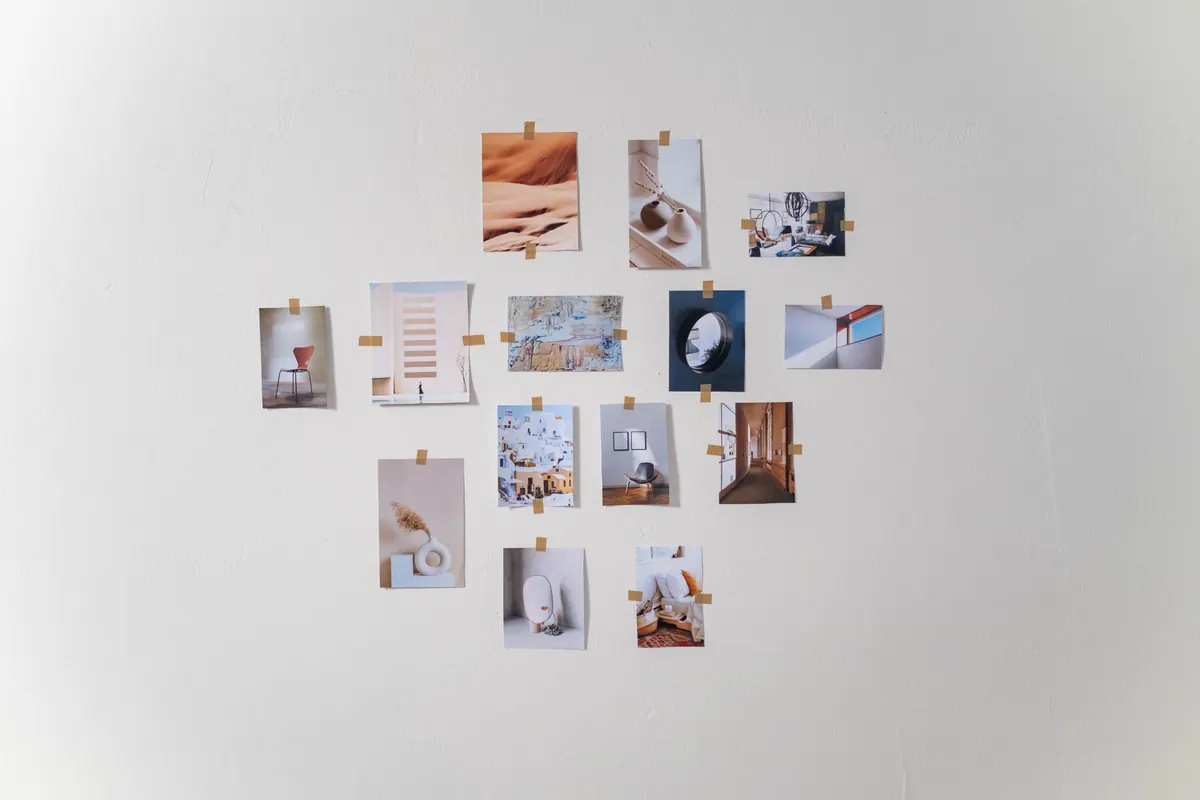
A gallery wall is one of the few decorating jobs that can change a room in an afternoon — and one of the easiest to get slightly wrong. The problem is rarely the pictures themselves. It is the spacing. Frames that drift too far apart, a mirror hung a hand's width too high, a scatter of small objects that reads as clutter rather than a collection. Sort the layout first, on paper and on the wall, and the rest becomes far more forgiving.
Before you lift a picture hook, decide what the wall has to do. Is it the focal point above a sofa, a narrow strip beside a doorway, or a backdrop to a sideboard that needs to stay useful? A wall carrying a lamp, a bowl and a stack of books wants a tighter, higher arrangement. An empty wall can take something looser and more generous.
Measure the width of the furniture below and the height from floor to ceiling, then mark a centre line with low-tack masking tape. Cut templates from lining paper or newspaper, trace round each frame and tape the shapes to the wall. This is the stage where you can be indecisive for free. Afterwards, every change costs you a hole.
Consistency matters more than any single rule. Once you have chosen a gap, keep it. A few reliable guides:
Work from the centre outwards, and don't chase perfect symmetry. A layout that is balanced but not mirrored looks collected rather than staged.
A mirror is the strongest thing you can put on a wall, which is why one is usually enough. It brings light into a dark corner and stops a small room feeling boxed in — but only if it reflects something worth seeing. Angle it towards a window, a lamp, greenery or the view through a doorway. A mirror reflecting a blank wall or the back of a door simply adds a dull rectangle.
Keep the mirror no wider than the piece of furniture below it, or it will appear to float. Hang it so the bottom edge sits comfortably above a mantel or console, and treat it as the anchor of the whole arrangement. Build the prints and smaller pieces around it rather than squeezing it into a gap at the end.
Mixing frames is where gallery walls get their character, and where they can start to look like a jumble sale. Give the arrangement one or two threads to hold it together:
Textiles, small mirrors, a clock, a shallow shelf and unframed canvases can all sit in the same arrangement, as long as the spacing rhythm stays the same.
Little objects are what make a wall feel personal, but they need a home rather than a scatter. A few ways to place them:
Leave some quiet space. A gallery wall with gaps reads as a collection; one with every square centimetre filled reads as noise.
Weight and wall type decide your fixings, not the other way round.
If you rent, check your tenancy agreement before you start, and remember that adhesive strips can lift paint from a poorly sealed wall. Picture ledges and frames leaning on a shelf are good alternatives where holes are not an option.
Stand back and take a photo from the doorway. A phone screen flattens everything and makes uneven spacing obvious in a way your eye forgives. Fix the gap that bothers you, swap one frame for something better, and leave a little room for the next thing you find. A good gallery wall is never finished in one go. It grows, and that is part of the pleasure.
Photo: cottonbro studio / Pexels
How to give a rental flat real style using removable wallpaper, freestanding furniture and plug-in lighting — plus...
Cool, grey north light can leave a room feeling flat. Here is how colour, layered lighting, mirrors and warm...
The common layout mistakes that shrink compact UK lounges, from wall-hugging sofas to undersized rugs, and the...

Curated motifs and decor for every home.