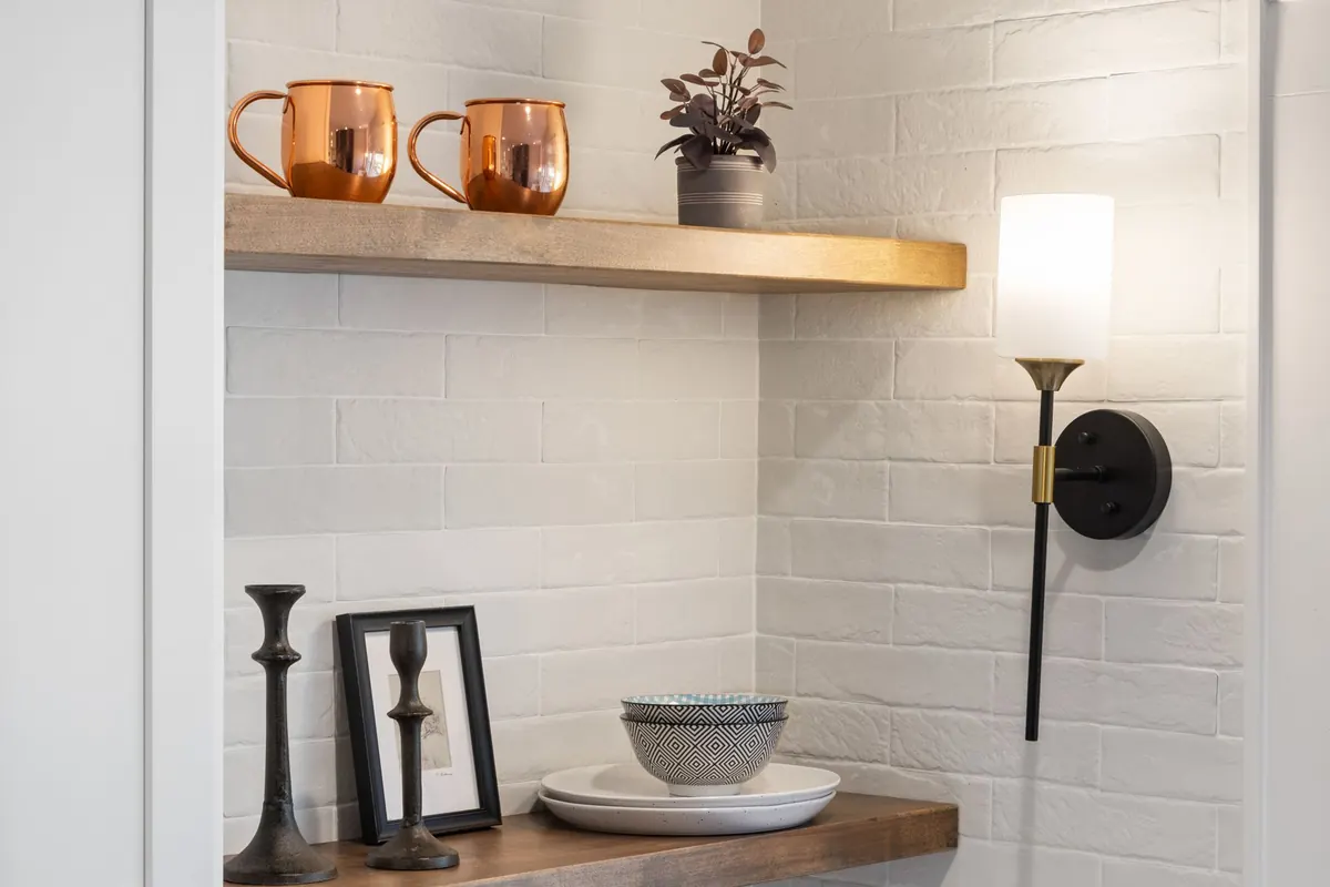
A shelf is one of the smallest decorating decisions in a room and one of the most visible. Get it right and it quietly pulls a space together, giving the eye somewhere to rest. Get it wrong and it becomes the job you keep meaning to finish. Most shelf styling goes wrong for the same handful of reasons, and every one of them is fixable in an afternoon with things you probably already own.
The instinct to use every centimetre is understandable, especially in a small home. But a shelf that holds everything holds nothing. When nine objects compete for attention, the eye gives up and the whole arrangement reads as clutter, however lovely each individual piece is.
Think of the shelf as a display surface that happens to hold things. On a shelf around a metre wide, aim for three to five objects or small groupings, and leave roughly a third of the length empty. That gap is not wasted space. It is what makes the pieces you have chosen look intentional.
A row of books all the same size, with a vase beside them of a similar height, is technically tidy and visually flat. Height is the cheapest source of interest you have, and it costs nothing to use.
Stand some books upright and lay two or three flat, then sit a small object on top of the stack. Lean a framed print against the back of the shelf rather than hanging it. Add one tall, slim element — a candlestick, a stem vase, a single dried stem in a bottle — to pull the eye upward. Aim for at least three different heights across the shelf, and remember that odd numbers of items tend to sit more comfortably than even ones.
Balance is not the same as symmetry. It is about how heavy each object feels to the eye. Dark, dense, bulky things read as heavy; pale, transparent or delicate things read as light. A chunky stack of hardbacks on the left of a shelf, answered by a single tiny ceramic bird on the right, will always look as though the shelf is tipping.
Place your tallest or heaviest piece roughly a third of the way in from one end, then step down in height across the shelf towards the other end. If you would rather work symmetrically, mirror the weight rather than the exact objects: a stack of books on the left can be answered by a bowl of similar visual mass on the right.
Every piece on a crowded shelf may be lovely on its own, but together they pull in different directions and the result feels restless. The fix is editing, not shopping. Choose two or three colours plus a neutral — off-white, warm wood and one accent such as olive green or soft rust, for example — and let everything outside that palette go elsewhere. Grouping books by spine colour is a quick way to create calm, though it does mean losing the alphabetical order you spent an evening arranging.
The same applies to the story the shelf tells. A shelf of shells, a shelf of ceramics and a shelf of travel finds can each work beautifully. All three at once usually cannot. Decide what the shelf is about, then rotate rather than squeeze: store half your favourites in a cupboard and swap them in a few times a year.
Equal gaps between objects create a showroom feel — precise, but a little dead. Real rooms feel layered. Push some pieces towards the back of the shelf and bring others forward. Overlap the edges of two frames by a few centimetres. Let a small object sit slightly off-centre, or tuck it in front of a stack of books so the arrangement has depth as well as width.
Keep this toolkit of accessory types in mind while you shuffle things around:
If your shelf contains only books and candles, that is exactly what it will look like. Four of these six is usually enough to make a shelf feel considered.
The space above and behind a shelf is part of the composition. A framed print hung so its bottom edge sits a few centimetres above the shelf ties the two together and stops the arrangement floating. Wall colour matters too: pale ceramics sing against a deep wall, and disappear against a pale one.
Light is the other half of it. A shelf tucked into a dark corner, or in the shadow beneath a wall cabinet, will lose all its detail no matter how well it is styled. If you cannot move it, shift the lightest-coloured objects to the shadiest end and keep deeper colours where the light falls.
If a shelf has been bothering you for months, do not redesign it from scratch. Empty it completely — all of it, including the pieces you are sure about — and start again.
Live with it for a week before changing anything else. Shelves are the easiest thing in a room to adjust, and the ones that look best have usually been quietly edited over months rather than styled once and left alone. Keep a small box nearby for whatever comes off, and bring those pieces back when the arrangement starts to feel stale.
Photo: Curtis Adams / Pexels
How to give a rental flat real style using removable wallpaper, freestanding furniture and plug-in lighting — plus...
Cool, grey north light can leave a room feeling flat. Here is how colour, layered lighting, mirrors and warm...
The common layout mistakes that shrink compact UK lounges, from wall-hugging sofas to undersized rugs, and the...

Curated motifs and decor for every home.